
The issue of the disappearing middle is not new, but credible economists have added a more threatening twist to the argument: the possibility that a well-functioning, efficient modern market economy, driven by exponential growth in the rate of technological innovation, can simultaneously produce economic growth and eliminate millions of middle-class jobs.Support for this argument in Edsall's piece comes from Andrew McAfee at MIT who provides this graph.

Since the Great Recession officially ended in June of 2009 G.D.P., equipment investment, and total corporate profits have rebounded, and are now at their all-time highs. The employment ratio, meanwhile, has only shrunk and is now at its lowest level since the early 1980s when women had not yet entered the workforce in significant numbers. So current labor force woes are not because the economy isn’t growing, and they’re not because companies aren’t making money or spending money on equipment. They’re because these trends have become increasingly decoupled from hiring — from needing more human workers. As computers race ahead, acquiring more and more skills in pattern matching, communication, perception, and so on, I expect that this decoupling will continue, and maybe even accelerate.McAfee tells Edsall:
“In my dystopian vision of the future, that red line (in the chart) keeps falling down – or suddenly drops off a cliff”Sounds scary. But what is it that the red curve is actually showing?
The graph below shows the annual change in unemployment and the annual change in the employment/population ratio, using the same data presented by McAfee and over the same time period.
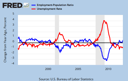
Now, my revealing that the red curve in the McAfee graph is just a fancy way to convey unemployment does not tell us whether or not we are entering a dystopian era of machines run amok. But being clear in what we are talking about is a helpful first step.